Creator Central

Creator Central

Creator Central

2.3k members

2.3k members

2.3k members

Join

Join

Join

For designers, editors, & creators using Lenovo devices to bring ideas to life.

For designers, editors, & creators using Lenovo devices to bring ideas to life.

For designers, editors, & creators using Lenovo devices to bring ideas to life.

Lenovo Shopping & Community Experiences

Lenovo Shopping & Community Experiences

ROLE

Product Designer

TEAM

2 PMs
1 UX Researcher
6 Designers

TIMELINE

May - Aug 2025

SKILLS

UXR & Testing
Product Thinking
Interaction Design
Visual Design
Prototyping
Design Systems
Client Work

TOOLS

Figma
Figjam
Lenovo Design Library

OVERVIEW

In a collaboration between Lenovo and Design Consulting Cornell, the university’s human-centered design consultancy, I served as a Senior Product Design Consultant on this project aimed at reimagining Lenovo.com and Lenovo Pro Community to help users discover, compare, and confidently purchase technology solutions. While leading and mentoring designers on the team, I specifically focused on designing a comprehensive product comparison tool on Lenovo.com, as well as community engagement features on the Lenovo Pro Community forum.

THE PROBLEM

As the tech industry rapidly evolves, Lenovo is navigating the challenge of redefining its role in creating smarter, more seamless, and tailored experiences for its diverse user base.

Lenovo, a US$57B global tech leader operating in 180 markets, serves a wide range of customers—including small and very small businesses (SMBs and VSBs) through its Lenovo Pro experience. Our team was tasked with exploring innovative solutions to enhance Lenovo Pro experiences on both Lenovo.com and the Lenovo Pro Community, a dedicated space for discussion and support. This led us to formalize two central focus questions:

HOW MIGHT WE

Streamline the shopping experience on Lenovo.com to make it more intuitive and trustworthy

to provide ease of navigation, comparison of products, and reliable user-generated reviews, ensuring they can confidently choose products that best meet their needs and preferences?

HOW MIGHT WE

Create a more compelling and engaging experience on Lenovo Pro Community

that empowers users to quickly access trusted insights that support their tech decisions, engage in relevant discussions, and ensure meaningful participation on the platform?

COMPETITOR ANALYSIS

Benchmarking and analyzing competitors to identify opportunity areas

To inform our design strategy, we analyzed 7 competitors across e-commerce (Apple, Dell, Microsoft, HP) and community platforms (Reddit, Intel, NVIDIA). This analysis revealed critical usability and engagement gaps in Lenovo’s platforms, which we translated into targeted opportunity areas for improvement.

Lenovo.com

E-COMMERCE COMPETITOR PLATFORMS

Key Gaps Identified

  • Overwhelming spec lists with limited context

  • Weak visual hierarchy and buried comparison tools

  • Lack of tailored shopping paths

Opportunity Areas

  • Surface comparison tools earlier in the journey

  • Use modular layouts and simplified specs

  • Leverage user preferences to tailor users’ navigation

Lenovo Pro Community

COMMUNITY FORUM COMPETITOR PLATFORMS

Key Gaps Identified

  • Minimal user incentives or role-based content

  • Forums organized chronologically, not personally

  • No visible signals for trusted contributors

Opportunity Areas

  • Introduce contribution-based reputation systems

  • Personalize content by user roles and interests

  • Visibly highlight authoritative contributors

USER RESEARCH

Interviewing 30 Lenovo users to uncover friction in Lenovo purchasing and community experiences

Before diving into design, we conducted 1:1 interviews with small business owners and tech decision-makers to better understand how they navigate Lenovo.com and engage with Lenovo Pro Community. Our goal was to uncover pain points in the product discovery journey and identify what drives—or hinders—participation in tech communities. We synthesized our findings into an affinity map, from which the following key insights emerged:

Navigation feels overwhelming

Navigation feels overwhelming

Users described the site structure as complex and unintuitive, often leading them to abandon searches or rely on external retailers.

Users described the site structure as complex and unintuitive, often leading them to abandon searches or rely on external retailers.

Users rely on outside sources for reviews

Users rely on outside sources for reviews

Rather than trusting Lenovo’s built-in tools and content, most turned to third-party reviews and videos to guide their purchase decisions.

Rather than trusting Lenovo’s built-in tools and content, most turned to third-party reviews and videos to guide their purchase decisions.

Lack of tailored content hinders relevance

Lack of tailored content hinders relevance

Discussions felt too general or outdated for users with specific roles. This lack of tailored experience reduced perceived value.

Discussions felt too general or outdated for users with specific roles. This lack of tailored experience reduced perceived value.

Passive structure discourages participation

Passive structure discourages participation

The platform prioritized browsing over interaction, lacking features like trending topics or user recognition that prompt active contribution.

The platform prioritized browsing over interaction, lacking features like trending topics or user recognition that prompt active contribution.

TEAM COORDINATION & FEATURE OWNERSHIP

Taking ownership of leading designs to enhance product discovery and community engagement

To address identified user pain points, our team divided feature development into priority areas. I took ownership of two key initiatives: designing an end-to-end product comparison tool on Lenovo.com to streamline discovery and decision-making, as well as creating community engagement features for Lenovo Pro Community to increase visibility, relevance, and participation.

IDEATION

Exploring possibilities via a Crazy-8s brainstorming session

To define feature directions for improving Lenovo.com’s purchasing flow and Lenovo Pro Community’s engagement, our team ran a Crazy-8s brainstorming session. This rapid sketching exercise helped us quickly surface, compare, and combine ideas to address the most critical user pain points.

ITERATION

Prioritizing high-impact, feasible features and designs.

After iterating on low-fidelity sketches, we moved into mid-fidelity design, focusing on core functionality and feasibility. At this stage, I prioritized the product comparison tool for Lenovo.com and the group engagement flow for Lenovo Pro Community, as they were features identified as both technically viable and most impactful in addressing key user pain points.

After iterating on low-fidelity sketches, we moved into mid-fidelity design, focusing on core functionality and feasibility. At this stage, I prioritized the product comparison tool for Lenovo.com and the group engagement flow for Lenovo Pro Community, as they were features identified as both technically viable and most impactful in addressing key user pain points.


LENOVO.COM

Product Comparison Page Layout

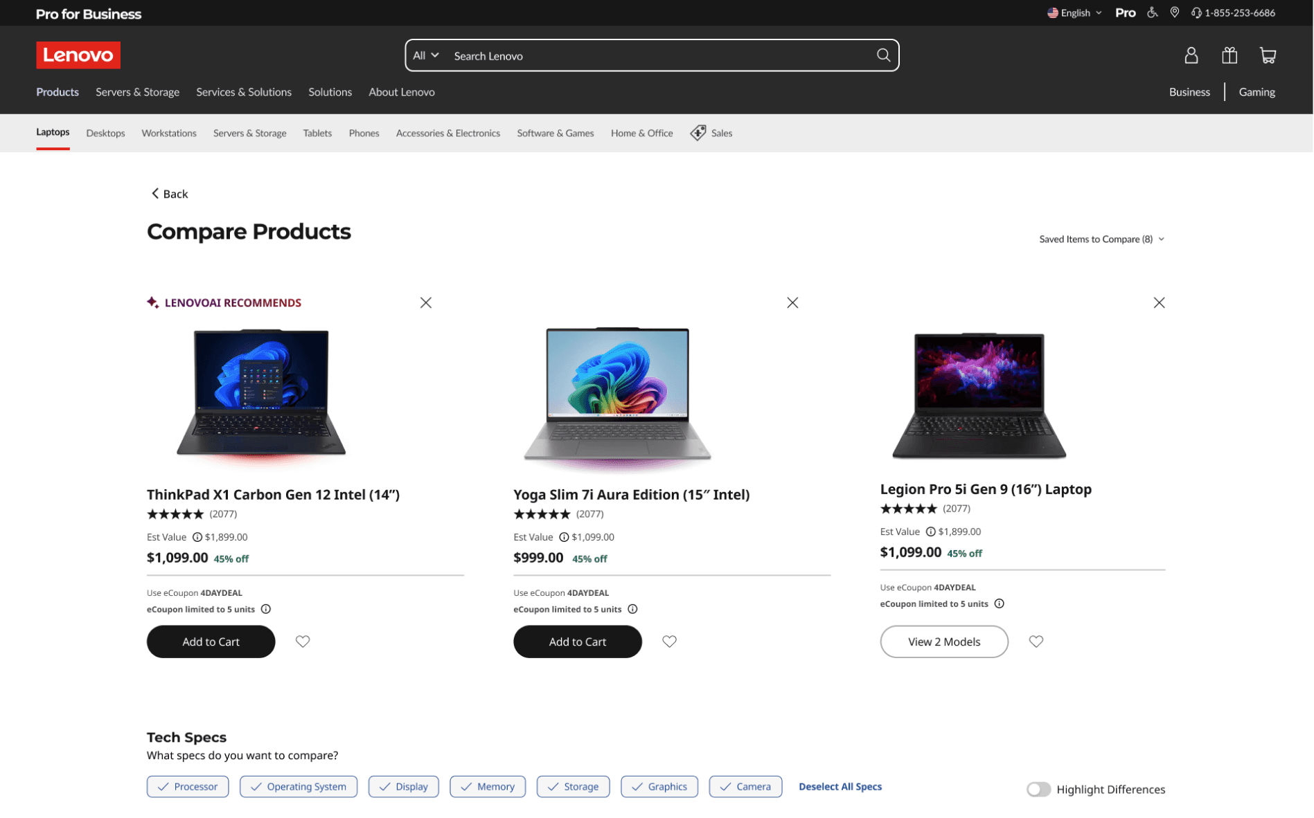
To explore the product comparison page layout, I tested various iterations, including the three presented below. After evaluating these options based on usability, flexibility, and decision-support capabilities, I selected Version 3. It allowed users to compare the most products simultaneously, while providing multiple decision aids, including filter tags to help users compare products based on their desired specifications and a Highlight Differences toggle for quickly spotting key distinctions. The team and I agreed that this combination maximized efficiency and best supported confident, informed purchasing decisions.

V1. Three-way comparison with Add Product entrypoint + spec filtering

Add Product button entrypoint allows users to add any Lenovo product to compare

Filtering by spec is not immediately intuitive, risking low discoverability and use

V2. Two-way comparison with a Saved Products sidebar + a Highlight Differences toggle

More immediately accessible entrypoint where user can view and browse their saved products to compare

Visually dense, layout could overwhelm users when more products are added to compare

V3. Three-way comparison with Saved Products entrypoint, tag-based spec filtering, + Highlight Differences toggle

Provides multiple features to guide the user in making an informed purchase decision

Tag-based spec filtering & highlight differences toggle are clear, intuitive, and useful for users

Saved Products to Compare entrypoint is clear in conveying to users that they can add and compare products from their Saved Lists

Adding Products to Compare

After finalizing the comparison page layout, I explored three interaction approaches for adding products to compare, aiming to balance visibility, browsing efficiency, and minimal disruption to the main comparison view. After evaluating these options, I selected Version 3 because it offered the richest set of interactions, intuitive categorization for easier product discovery, and a less intrusive experience that preserved the context of the comparison page.

V1. Large Vertical Drawer

Tall scrollable list accommodates view of many products at once

Visually intrusive, blocking a large portion of the page and disrupting context

V2. Horizontal Drawer

Compact footprint preserves the full product comparison view

Horizontal scrolling is less intuitive and limits quick scanning of product options

V3. Drawer Popover w/ Various Interactions

Categorized tabs help users quickly locate products

Supports more interactions like Swap Product, Remove from Saved, and Search for More Products, which allow comparison of many items without overwhelming the screen

Slightly more complex, but reduced intrusiveness and added functionality outweigh the trade-off

Accounting for Affordances & Edge Cases

To ensure robustness of the design, I considered multiple affordances and edge case—the maximum number of products that can be compared, the user experience when exceeding that limit, the flow for swapping products, and how the design integrates with Lenovo’s existing AI comparison tool.

Added Product to Compare

Compare Up to 4 Products At a Time

Swap Product to Compare

AI Integration

Product Comparison Tool Final Designs

lenovo.com

lenovo.com

LENOVO PRO COMMUNITY

The Current Explore & Join Groups Page

On Lenovo Pro Community, the Groups page currently presents users with a simple scrollable list of available communities. I aimed to redesign the page into a more personalized discovery experience, encouraging users to join groups aligned with their interests and fostering long-term participation.

Current Groups Page

Groups shown in a plain list with minimal context, offering little reason to join

No hierarchy or highlights for recommended groups, reducing motivation

Static, non-personalized layout that feels generic and overwhelming

Elevating the Group Browsing Experience

To create a more engaging exploration experience, I iterated on multiple card styles—testing variations in layout, hierarchy, and the placement of the Join Group CTA. For each design I explored how best to balance group information with visual clarity, to ensure the cards felt inviting while making optimal use of the page’s layout. I chose the iteration highlighted in green because its compact nature allowed for the most efficient use of page real estate.

Lenovo Laptops

2.2k members

Lorem ipsum dolor sit amet, powered by Lenovo AI. Lorem ipsum dolor sit amet.

Join

Lenovo Laptops

Lorem ipsum dolor sit amet, powered by Lenovo AI. Lorem ipsum dolor sit amet.

2.2K

392

Join

Lenovo Laptops

2.2K

392

Lorem ipsum dolor sit amet, powered by Lenovo AI. Lorem ipsum dolor sit amet.

Join

Lenovo Laptops

2.2K

392

Lorem ipsum dolor sit amet, powered by Lenovo AI. Lorem ipsum dolor sit amet.

Join

Lenovo Laptops

2.2K

392

Lorem ipsum dolor sit amet, powered by Lenovo AI. Lorem ipsum dolor sit amet.

Join

Lenovo Laptops

2.2k members

Join

Lorem ipsum dolor sit amet, powered by Lenovo AI. Lorem ipsum dolor sit amet.

Lenovo Laptops

2.2K

392

Join

Lorem ipsum dolor sit amet, powered by Lenovo AI. Lorem ipsum dolor sit amet.

Giving Users a Voice: Group Pitches

Then, to make the Lenovo Pro Community feel more personalized and participatory, I introduced a group pitches flow. If users don’t find existing groups relevant, they can propose new group ideas, vote on others’ pitches, and have them reviewed by moderators. I explored multiple entry points, ultimately selecting the green iteration for its visual cohesion with redesigned group cards and compact layout, which allowed users to scan and engage with multiple pitch ideas at once.

Community Groups & Engagement Final Designs

lenovo.com

REFLECTIONS

Good design should guide, not decide

In designing these user experiences, I learned that good design shouldn’t make choices for users; it should instead help them make informed ones. By presenting information clearly and surfacing what matters most to each user, the experience should be less about recommending a single “best” option and more about empowering users to feel confident in their own decisions.

Design for the "what ifs", one detail at a time

No user journey is perfectly linear. By proactively designing for uncommon paths and failure states, I ensured users could always recover and continue exploring without frustration. The result was a smoother, more predictable experience at scale.

The Current Explore & Join Groups Page

On Lenovo Pro Community, the Groups page currently presents users with a simple scrollable list of available communities. I aimed to redesign the page into a more personalized discovery experience, encouraging users to join groups aligned with their interests and fostering long-term participation.

Current Groups Page

Groups shown in a plain list with minimal context, offering little reason to join

No hierarchy or highlights for recommended groups, reducing motivation

Static, non-personalized layout that feels generic and overwhelming

Elevating the Group Browsing Experience

To create a more engaging exploration experience, I iterated on multiple card styles—testing variations in layout, hierarchy, and the placement of the Join Group CTA. For each design I explored how best to balance group information with visual clarity, to ensure the cards felt inviting while making optimal use of the page’s layout. I chose the iteration highlighted in green because its compact nature allowed for the most efficient use of page real estate.

Lenovo Laptops

2.2k members

Lorem ipsum dolor sit amet, powered by Lenovo AI. Lorem ipsum dolor sit amet.

Join

Lenovo Laptops

Lorem ipsum dolor sit amet, powered by Lenovo AI. Lorem ipsum dolor sit amet.

2.2K

392

Join

Lenovo Laptops

2.2K

392

Lorem ipsum dolor sit amet, powered by Lenovo AI. Lorem ipsum dolor sit amet.

Join

Lenovo Laptops

2.2K

392

Lorem ipsum dolor sit amet, powered by Lenovo AI. Lorem ipsum dolor sit amet.

Join

Lenovo Laptops

2.2k members

Join

Lorem ipsum dolor sit amet, powered by Lenovo AI. Lorem ipsum dolor sit amet.

Lenovo Laptops

2.2K

392

Join

Lorem ipsum dolor sit amet, powered by Lenovo AI. Lorem ipsum dolor sit amet.

Giving Users a Voice: Group Pitches

Then, to make the Lenovo Pro Community feel more personalized and participatory, I introduced a group pitches flow. If users don’t find existing groups relevant, they can propose new group ideas, vote on others’ pitches, and have them reviewed by moderators. I explored multiple entry points, ultimately selecting the green iteration for its visual cohesion with redesigned group cards and compact layout, which allowed users to scan and engage with multiple pitch ideas at once.

Community Groups & Engagement Final Designs

lenovo.com

LENOVO PRO COMMUNITY

THANK YOU!

A huge thank you to Lenovo for collaborating with Design Consulting @ Cornell on this project. Reimagining how Gen Z and Millennial IT decision-makers shop and engage across Lenovo.com and Lenovo Pro Community was both a challenge and a privilege. This experience deepened my understanding of designing at scale, and how to balance clarity, trust, and engagement across interconnected ecosystems.

REFLECTIONS

Good design should guide, not decide

In designing these user experiences, I learned that good design shouldn’t make choices for users; it should instead help them make informed ones. By presenting information clearly and surfacing what matters most to each user, the experience should be less about recommending a single “best” option and more about empowering users to feel confident in their own decisions.

Design for scale, one detail at a time

No user journey is perfectly linear. By proactively designing for uncommon paths and failure states, I ensured users could always recover and continue exploring without frustration. The result was a smoother, more predictable experience at scale.


Thanks for stopping by!

Curious to collaborate? Let's make it happen!

Made with

by Erica © 2025

Thanks for stopping by!

Curious to collaborate? Let's make it happen!

Made with

by Erica © 2025